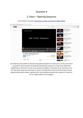
Question 4
                           Z- Diary – Opening Sequence
            Link to video on Youtube- http://www.youtube.com/watch?v=NgDn-It4d5A


Our Video has been publish on youtube along with annotation On certain scene, on this scene we’ve
   presented in the annotation the production/distribution company in a Type writer effect that
established our title Font in courier as we wanted to establish a connection to our main focus in on
 the Type writer as the font and style is in courier. The JAW Films stands for the first letters of each
group member which creates a significant link. We Decided to keep the font simple so it’s easier to
                                for our target audience to be engaged.
The Use of a class room has a connection straight away with our target audience as most age groups
are entitle to free or pay for education these days, and most of the audience are still in or have been
in education before so they can realise that the first set is based in a class room from the tables and
                                            the white board.


Corridors are easily recognise by schools, colleges or even offices especially when bulletin boards are
 put up and class room names and numbers, and this can give a sense of nostalgia however with a
 menacing figure at the end of the corridor changes that and creates fear and anxiety, as well as the
                          dim lighting and wide shot establish a silhouette.

Question 4

  • 1.
    Question 4 Z- Diary – Opening Sequence Link to video on Youtube- http://www.youtube.com/watch?v=NgDn-It4d5A Our Video has been publish on youtube along with annotation On certain scene, on this scene we’ve presented in the annotation the production/distribution company in a Type writer effect that established our title Font in courier as we wanted to establish a connection to our main focus in on the Type writer as the font and style is in courier. The JAW Films stands for the first letters of each group member which creates a significant link. We Decided to keep the font simple so it’s easier to for our target audience to be engaged.
  • 2.
    The Use ofa class room has a connection straight away with our target audience as most age groups are entitle to free or pay for education these days, and most of the audience are still in or have been in education before so they can realise that the first set is based in a class room from the tables and the white board. Corridors are easily recognise by schools, colleges or even offices especially when bulletin boards are put up and class room names and numbers, and this can give a sense of nostalgia however with a menacing figure at the end of the corridor changes that and creates fear and anxiety, as well as the dim lighting and wide shot establish a silhouette.